Meet Fluent, Microsoft’s New Design System
At the 2017 Microsoft Build Conference, the company announced the Fluent Design System, Microsoft’s new design language. Fluent was no secret. Developed under the “Neon” codename, Fluent adds translucency and animation to Microsoft Design Language 2, the design system used for Windows 10.

MDL2 was not a name of choice for Microsoft. After getting burned with Metro, Microsoft had to quit using the name and settled with a rather uninspiring Microsoft Design Language for their UI/UX efforts. And while “Neon” sounds great, Microsoft decided to play safe and use “Fluent Design System” to describe their design style.
This time, Microsoft nailed it. Fluent represents a precisely new design concept. Or at least, that’s the new marketing wording because we have yet to see Fluent. Anyway, it seems that Microsoft managed to solve its naming/identity problem. Imagine if Cortana was named “Microsoft Digital Personal Assistant for Windows 2016” or “MDPAW 10.”
Is Fluent the Design System of the Future?
It was about time for Microsoft to give an official name to their design style, especially since it was one of the first flat design adopters with their metro style. By the way, Microsoft doesn’t want you to refer to Fluent as a design language but rather as a design system. With Fluent, Microsoft puts emphasis on interactivity rather than on appearance alone.
“A rapid evolution is underway in user interfaces. The spectrum of dimensionality expands from zero to four. We speak, type, ink, touch, and gaze. We’re engaged and immersed. We’re surrounded by devices, interactions, and experiences. To translate across dimensions and contexts, we need to solve for a sensory digital world and be fluent in our designs.”
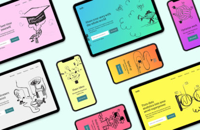
No-Code Email Template BuilderWith Postcards you can create and edit email templates online without any coding skills! Includes more than 100 components to help you create custom emails templates faster than ever before.
Try FreeOther Products
Expanding to 3D
Fluence is not only a design paradigm for traditional screens and inputs, but it’s also a vision for revolutionary user interfaces. Fluent is aimed at various form factors such as virtual reality, augmented reality, phones, tablets, desktop PCs, wearables or games consoles.
You wouldn’t expect less from a company that released a lot of new devices such as the Surface Studio, Hololens, etc. For Microsoft, thinking in 2D is no longer possible:
“The industry lives and breathes 2D design. Now’s the time to expand our toolkit for more dimensions. We’re scaling our design system from 0D to 3D, inviting innovation across new forms. And we’re looking to you to help us imagine this new world.”
Unlike Microsoft Design Language 2, a.k.a. Modern, that was built with a focus on touch, Fluent will work with various touch inputs such as motion controllers, gestures, voice, pen, etc. Fluent is different from the typography-oriented Metro.

Fluent will allow Microsoft and developers to craft cross-platforms experiences and interactions that are harmonious, modern, inclusive and responsive.
Fluent’s Key Elements
- Light
- Depth
- Motion
- Material
- Scale
Light
Light describes a distraction free interface that focuses on the specific interaction between user and interface.
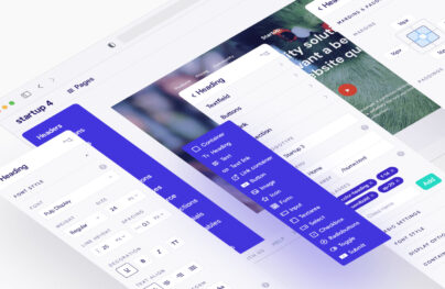
With Startup App and Slides App you can build unlimited websites using the online website editor which includes ready-made designed and coded elements, templates and themes.
Try Startup App Try Slides AppOther ProductsDepth
Depth uses multiple layers to add expression and continuity between elements and objects.
Motion
For Motion, Microsoft establishes contextual relationships and connections between interface elements.
Material
Will make use of screen estate to deliver legibly and clutter-free content.
Scale
The most interesting is Scale. Microsoft envisions interfaces that go way beyond 2D and typical displays to new form factors including VR and AR. It’s not scale by dimension but scale by medium.
Get Started with Fluent … Not So Fast!
FLuent is not quite ready for prime time. For now, you can have a look at the design guidelines for UWP apps, but they are not quite the same as what Fluent stands for. You may also want to have a look at Acrylic material for creating transparent textures, Connected animation to get an idea on animation the Microsoft way, or at Reveal to test depth and focus, but it’s not yet the real thing.
![]()
Judging by Microsoft’s wording, Fluent is way more complex than what MDL2 is now. Even Microsoft’s own apps are somehow disconnected with Fluent as they lack the five distinct traits of the new design language. It looks like we’ll have to wait until autumn when Microsoft will deliver the Fall Creators Update. Until then, have a look at Groove music app that introduces lur and hover, to get a sense of what Microsoft is aiming for.
At this point, it’s obvious that Fluent’s scale won’t fit Microsoft’s six-month update cycle. Further, the much-anticipated Creators Update that got shipped last months failed to impress, at least design wise.
Will Microsoft manage to succeed where Google and Apple are still struggling? One thing is for sure, Microsoft is about to get more transparent. And not only on Windows. If you are eager to meet Fluent, hop on the preview builds of Windows 10 Redstone 3, and … wait.